The web is abandoning the list. For nearly a decade, the dominant design paradigm was the infinite feed a linear, never-ending scroll of content optimized for retention but often disastrous for clarity. Then came the shift. It started subtly in operating system dashboards and exploded with Apple’s promotional materials and the “Linear” app design language. We entered the era of the Bento Grid.
This aesthetic is not merely a trend; it is a response to information overload. By compartmentalizing diverse data points into distinct, unified, and interactive rectangles, designers can present complex hierarchies that feel deceptively simple. It is the digital equivalent of a well-organized desk. For WordPress developers and site owners, this shift represents a profound opportunity to move away from the standard “header-hero-body-footer” stack and towards a dashboard-style interface that feels tactical, modern, and incredibly premium. This article explores not just the “how-to” of building these grids, but the design philosophy required to make them feel authentic to the Apple aesthetic.
The Rectilinear Revolution: Why Boxes Are Back
The resurgence of the grid is rooted in the cognitive need for boundaries. In a standard open layout, the eye wanders, looking for anchors. In a Bento layout, every element is framed. This framing does two things: it elevates the content within the frame to the status of an “object,” and it creates a clear separation of concerns. When you look at an Apple summary slide, you see a battery life statistic next to a processor chip render, next to a textual feature list. They are disparate types of content, yet the grid unifies them.
This “objectification” of content is crucial. In this design language, a blog post isn’t just text on a white background; it is a card. A product isn’t just an image; it is a tactile tile. This shift in thinking changes how we approach layout. We are no longer designing pages; we are designing systems of modular components that stack and rearrange themselves based on priority. It brings the precision of Swiss Style graphic design with its mathematically rigid grids and sans-serif typography into the fluid, responsive world of the web. It demands a discipline that standard WordPress themes often lack, requiring us to rethink spacing, corner radii, and the relationship between negative space and content density.
Constraint as a Creative Catalyst
When you commit to a Bento grid, you are voluntarily accepting strict constraints. You cannot simply let text flow indefinitely; it must fit the box. This limitation is actually a superpower for designers. It forces conciseness. It forces better image selection. It forces a rigorous evaluation of what is truly important. However, the execution of this rigid structure within the fluid environment of the browser is where the challenge lies.
This is where the intersection of WordPress & Web Design becomes a battleground for creativity. The traditional WordPress editor was built for documents, not complex spatial dashboards. To achieve the Bento look, we must subvert the standard flow of the CMS. We are asking WordPress to stop behaving like a word processor and start behaving like a layout design tool similar to Figma. This requires a deep understanding of the underlying architecture of the web specifically CSS Grid—and a willingness to bypass the “easy” settings of pre-made themes in favor of custom block configurations that respect the strict geometry of the Bento aesthetic.
Deconstructing the “Card” Anatomy
To recreate the Apple aesthetic, one must dissect the fundamental atom of the Bento grid: the Card. An Apple-style card is never just a div with a border. It is a composite of highly specific design decisions that create a feeling of “premium” depth. First, consider the background. It is rarely a flat color. It is often a subtle off-gray (like #F5F5F7 in light mode or #1D1D1F in dark mode), frequently paired with a backdrop-filter: blur() effect if it sits on top of a dynamic background.
Then there is the typography. The hierarchy inside a Bento card is aggressive. The headline is usually small but bold, often uppercase, serving as a label. The primary data (the “hero” of the card) is massive. This contrast between the tiny metadata and the huge focal point—is what makes the card scannable. Finally, the border radius is non-negotiable. The Apple aesthetic relies on “super-ellipses” or highly smoothed corners (usually around 20px to 30px depending on card size), which makes the interface feel friendly and approachable rather than industrial and sharp. In WordPress, achieving this requires standardized Global Styles (theme.json) to ensure that every single block inherits the exact same border radius, preventing a disjointed look.
The Engine Room: CSS Grid vs. Flexbox
Many WordPress users attempt to build Bento layouts using Flexbox (columns), but this is a mistake. Flexbox is one-dimensional; it handles rows or columns. The Bento grid is inherently two-dimensional. It requires items to span across multiple row tracks and column tracks simultaneously. The only robust way to build this is using CSS Grid.
In a WordPress context, this often means creating a custom HTML block or using a “Grid” container block that supports explicit grid definitions. You want to define a 12-column or 24-column underlying grid. A large “Hero” card might span grid-column: span 12 and grid-row: span 2. A smaller “Stat” card might be grid-column: span 6 and grid-row: span 1. The beauty of CSS Grid is the gap property. The “gutters” between your Bento boxes must be perfectly consistent. If you have a 16px gap horizontally, you must have a 16px gap vertically. This mathematical perfection is what the human eye perceives as “quality,” even if the user can’t articulate why.
Orchestrating Gutenberg for Spatial Layouts
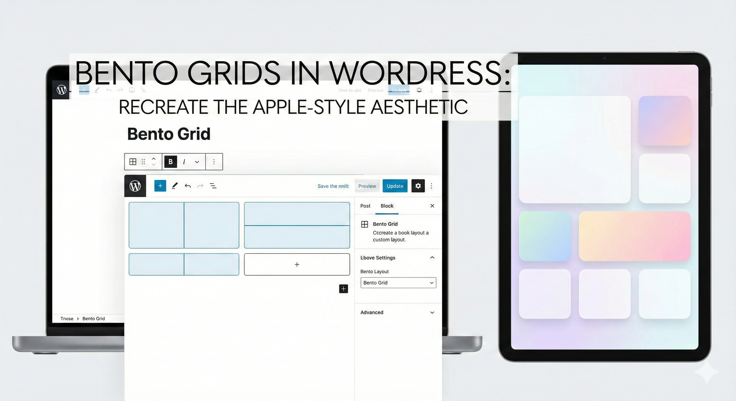
The Gutenberg Block Editor has matured to a point where Bento grids are natively possible, though they require patience. The key is the “Group” block. You should visualize your entire page section as one parent Group block set to “Grid” layout (if your WordPress version supports the new Grid interaction) or a custom container. Inside this parent, every “Card” is a nested Group block.
To achieve the “bento” variance where some boxes are big and some are small you have to manipulate the layout settings of these child Group blocks. You are looking for settings often labeled “Column Span” or “Row Span” in advanced block plugins like GenerateBlocks or GreenShift. If sticking to core WordPress, you may need to apply custom CSS classes to specific Group blocks (e.g., .bento-wide, .bento-tall, .bento-hero) and define their grid-spanning behavior in your stylesheet. This hybrid approach using Gutenberg for content management but CSS for structural rigidity preserves the editability of the site for the client while maintaining the integrity of the design.
The Art of the “Squish”: Micro-interactions and Physics
A static Bento grid looks good; a moving one feels like Apple. The “Apple aesthetic” is heavily reliant on physics-based animation. When a user interacts with a card, it shouldn’t just change color; it should react spatially. This is where scale transformations come into play. A common pattern is a subtle scale-down effect on click (e.g., transform: scale(0.98)) and a subtle lift and shadow expansion on hover.
However, the trend is moving beyond simple hovers. We are seeing “tilt” effects where the card rotates slightly in 3D space following the mouse cursor, revealing a sheen or glare that mimics glass or metal. In WordPress, this can be achieved via lightweight JavaScript libraries or specialized block addons that support “Mouse Track” effects. The key here is subtlety. The movement should be almost imperceptible a “micro-interaction” rather than a flashy animation. It should feel like the interface is made of physical material that yields to the user’s touch.
Content Density and the “Glanceability” Factor
The success of a Bento grid relies on “glanceability.” You are presenting multiple narratives simultaneously. A user landing on your site should be able to absorb your latest project, your contact info, your primary service, and a testimonial, all without scrolling. This requires a ruthless approach to content editing.
Each card in your grid needs a singular purpose. Do not try to stuff a whole paragraph and a button and an image into a 1×1 square unit. If the unit is small, it gets an icon or a number nothing else. If the unit is wide (2×1), it can handle a headline and a sentence. If it is large (2×2), it can host an image or a video. This discipline prevents the “cluttered dashboard” effect. In WordPress, this means using the “Query Loop” block creatively. Instead of one long loop, you might have five different Query Loops in five different grid cells, each pulling a specific type of content (one pulls the latest case study, one pulls the latest tweet, one pulls a featured product).
Mobile Adaptation: The Collapse
The beautiful, complex mosaic of a Bento grid faces a crisis on mobile devices: the screen is too narrow for a multi-column layout. The lazy solution is to stack everything vertically in a single column. While functional, this destroys the “Bento” feel and turns it back into a list.
A more sophisticated approach for 2026 is to maintain a 2-column grid on mobile for smaller elements (icons, stats) while letting larger elements take full width. This preserves the “tiled” aesthetic even on small screens. Furthermore, Apple-style design often employs horizontal scrolling containers (carousels) on mobile to keep the vertical height manageable. In WordPress, this translates to setting your Grid container to display: flex; flex-wrap: nowrap; overflow-x: auto; on mobile breakpoints. This allows users to swipe through a row of Bento boxes, maintaining the spatial metaphor without creating an infinitely long page.
The Role of Imagery and Media
In a Bento grid, images are not decorative; they are structural. Because the grid lines are so rigid, the organic nature of photography provides the necessary contrast. However, the images must be art-directed. You cannot simply throw a stock photo into a grid cell and expect it to work. The image needs to be cropped to fit the specific aspect ratio of the cell (1:1, 16:9, 9:16).
Background removal is a massive trend within this aesthetic. Placing a product (like a shoe or a phone) on a transparent background and sitting it inside a colored card looks significantly more modern than a rectangular photo. In WordPress, this means utilizing the “Cover” block effectively, often with custom focal points set to ensure the subject of the image doesn’t get cut off when the grid resizes. The integration of video specifically autoplaying, muted loops adds a layer of life to the grid. A 2×2 cell playing a silent showreel creates a “live window” effect that draws the eye immediately.
Typography as Texture
Since Bento grids reduce the amount of chrome (lines, dividers, shadows) in favor of blocks of color, typography becomes the primary texture of the interface. The Apple aesthetic heavily favors variable fonts sans serifs that can range from extremely thin to extremely heavy.
The trend is to use “Display” weights for numbers and short headlines. A giant “98%” taking up an entire 1×1 cell is a design element, not just text. It adds graphical weight. WordPress users should load a high-quality variable font (like Inter or Manrope) and utilize the “Typography” settings in the block editor to tweak letter-spacing (tracking). Apple often uses tight letter-spacing on large headlines (-0.02em) to make the text feel like a solid block, and looser spacing on small captions to improve readability. These microscopic adjustments accumulate to create the “premium” feel.
Future-Proofing the Grid
The Bento grid is not a fleeting trend because it solves a fundamental problem of the responsive web: modularity. As we move toward more diverse device sizes from foldables to spatial computing headsets the modularity of the Bento grid makes it future-proof. A card is a card, whether it is displayed on a 27-inch monitor or floating in an AR interface.
For the WordPress ecosystem, this signals a move away from “Page Builders” that paint entire canvases, toward “System Builders” that manage libraries of independent components. The site of the future is a collection of these intelligent blocks. By mastering the Bento grid now, you are not just copying a style; you are adopting a component-based methodology that aligns with the future of software development. You are building a site that is scalable, maintainable, and, most importantly, respectful of the user’s attention.
Conclusion
Recreating the Apple-style aesthetic in WordPress is an exercise in restraint and precision. It requires you to look past the default templates and engage with the raw materials of web design: the grid, the box, and the content. It demands a shift in mindset from “decorating a page” to “architecting information.”
By leveraging the power of CSS Grid, utilizing the modular nature of the Gutenberg editor, and adhering to strict rules regarding spacing, typography, and motion, you can transform a standard WordPress installation into an experience that rivals the best product dashboards in the world. The result is a website that feels less like a brochure and more like a tool clear, confident, and unapologetically modern. The Bento grid is here to stay, and it is time for your WordPress site to think inside the box.