The digital landscape of the last decade has been defined by a relentless pursuit of frictionless optimization. We scrubbed away textures, flattened shadows, aligned everything to rigid 12-column grids, and sanitized interfaces until they were perfectly efficient, universally understandable, and entirely forgettable. We created a digital world of pristine, sanitized hallways easy to navigate, but devoid of soul, character, or reason to linger.
As we move firmly into 2026, a profound fatigue has set in. The user, bombarded by identical sans-serif fonts and predictable card layouts, has become desensitized. The “sea of sameness” is no longer just a branding problem; it is an engagement crisis. When every digital experience feels like a slightly recolored version of the same template, boredom becomes the default user state.
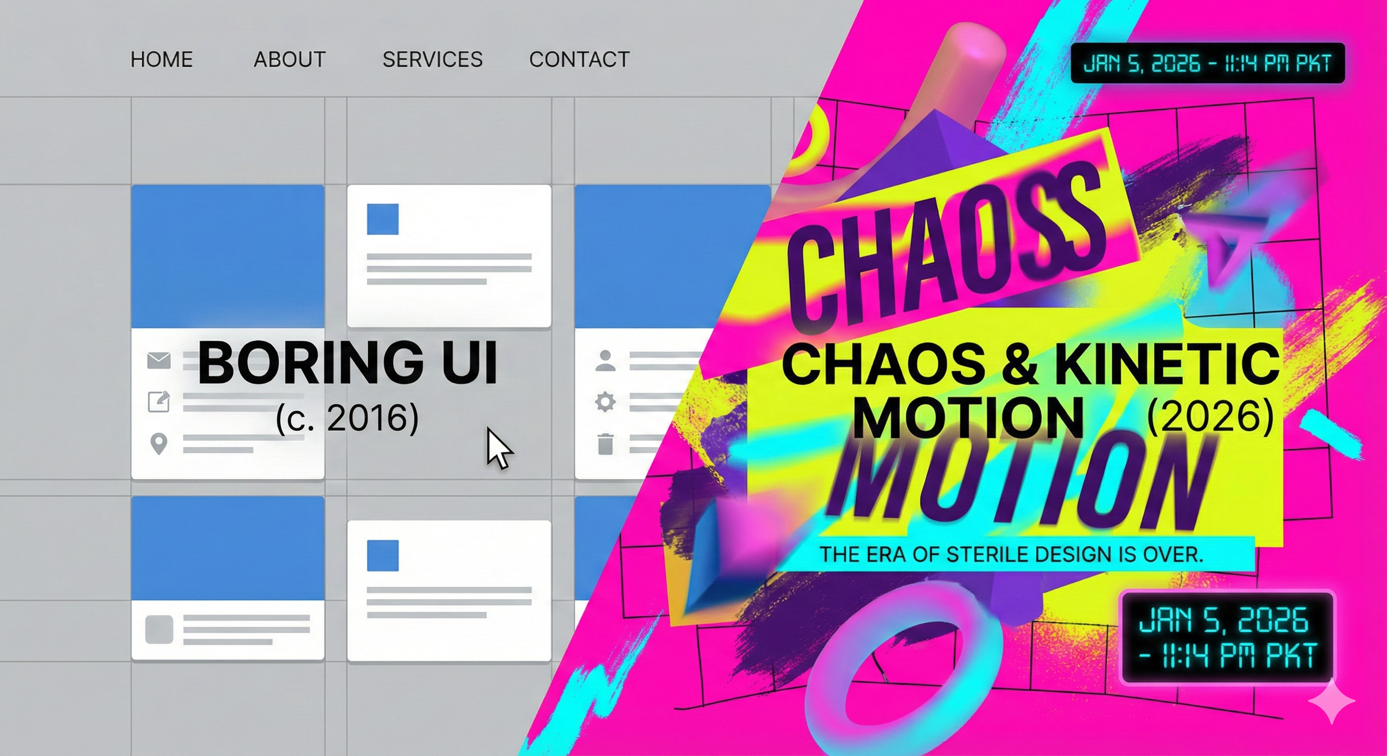
The antidote to this stagnation is not a return to the cluttered skeuomorphism of the past. It is an aggressive push forward into a new era of digital vitality defined by two powerful, intertwined forces: controlled “Chaos” and total Kinetic Motion. This is not about breaking usability; it is about breaking expectations. It is a recognition that in 2026, an interface must do more than just function; it must feel alive, unpredictable, and physically reactive to capture the attention of a highly stimulated audience.
The Tyranny of the Grid and the Crisis of Sameness
How did we get here? The dominance of boring UI was born from good intentions. The rise of mobile computing demanded responsive frameworks, leading to the widespread adoption of rigid grid systems like Bootstrap. Simultaneously, the philosophy of “don’t make me think” was taken to its extreme, resulting in the standardization of every UI pattern. A hamburger menu here, a hero image there, three feature blurbs below.
While this standardization lowered the learning curve for users, it also homogenized the internet. Brands stripped away their unique visual eccentricities in favor of “best practices.” The result is a digital environment that feels clinical. We prioritized the speed of transaction over the quality of the interaction.
In 2026, efficiency is merely table stakes. It is expected. The competitive advantage has shifted back to differentiation and emotional connection. A perfectly usable, boring interface is now a liability because it fails to register in the user’s memory. The human brain is wired to ignore repetitive patterns and focus on novel stimuli. By adhering too strictly to the “rules” of sterile design, companies are practically guaranteeing their digital products will be ignored.
Redefining “Chaos”: The Rise of Anti-Design and Controlled Disruption
When we speak of “Chaos” in the context of 2026 UI, we are not advocating for poor navigation or confusing information architecture. We are speaking of “controlled disruption” a deliberate aesthetic rebellion against the sanitized norms that have dominated traditional Web design for too long, aiming to create arresting visual experiences that force the user to pay attention.
This trend, often branching into “Neobrutalism” or “Anti-Design,” embraces raw, unpolished aesthetics that feel inherently digital rather than mimicking physical reality. It involves breaking the grid, overlapping elements that “shouldn’t” touch, using aggressive typography that acts as image rather than just text, and utilizing clashing color palettes that vibrate with energy.
“Chaos” means reintroducing friction where it serves a purpose. It means allowing a headline to bleed off the edge of the screen to imply kinetic energy. It means using asymmetrical layouts that guide the eye through surprise rather than predictable scanning patterns. This aesthetic signals confidence. It tells the user: “We know the rules well enough to break them effectively.” This controlled unpredictability is magnetic; it transforms passive scrolling into active exploration. The user cannot autopilot through a “chaotic” interface; they must engage with it, and that engagement is the first step toward memorability.
Kinetic Motion: Moving Beyond “Delight” to Essential Function
If chaos provides the visual hook, kinetic motion provides the heartbeat. For years, animation in UI was treated as “sprinkles on top” a nice-to-have layer added at the end of a project to provide “delight.” In 2026, motion is not a garnish; it is the main ingredient. The interface is no longer a series of static pages linked together; it is a continuous, fluid environment where everything is in a state of potential movement.
Kinetic motion goes far beyond simple hover states or loading spinners. It is about creating a physics-based digital reality. When a user interacts with an element, it shouldn’t just change color; it should react with weight, momentum, and elasticity. If you drag a card, it should carry inertia. If you press a button, it should depress with satisfying resistance and spring back.
Furthermore, motion is being used as a primary cognitive aid. Kinetic typography, where text morphs, stretches, and re-arranges itself based on user scroll or input, turns reading into an interactive experience. Sophisticated page transitions no longer just “fade in” new content; they spatially explain where the user is going and where they came from, morphing existing elements into new ones to maintain a continuous narrative thread. This constant, fluid motion keeps the user’s brain engaged, reducing the perceived cognitive load of navigating complex systems because the interface itself is doing the heavy lifting of explaining spatial relationships.
The Psychology of Disruption: Why Our Brains Crave Novelty
The shift toward chaos and kinetic motion is deeply rooted in human psychology. Our brains are prediction machines. When confronted with a highly structured, predictable environment like a standard flat design website the brain quickly learns the pattern and tunes out, conserving energy. This is why you can browse most modern websites without really seeing them.
“Chaos” acts as a pattern interrupt. When elements overlap, or colors clash, or layouts shift unexpectedly, the brain’s prediction models fail. This forces a state of heightened alertness. The brain must actively process the scene to understand it. This momentary surge in cognitive arousal is the window where engagement happens.
Kinetic motion, on the other hand, taps into our primal instinct to track movement. In the physical world, movement usually signifies something important a threat, an opportunity, a living thing. By imbuing interfaces with constant, organic motion, we trigger this deep-seated tracking instinct. An interface that feels alive elicits an emotional response that static pixels never could. It creates a sense of digital empathy; the system seems to feel and react to the user’s presence, fostering a deeper connection than mere utility ever could.
Implementing the New Wave: Balancing Vitality with Usability
Embracing chaos and kinetic motion is not a license to abandon fundamental UX principles. The challenge of 2026 is balancing this newfound vitality with core usability. The goal is an interface that is thrilling, not exhausting.
The key lies in establishing a hierarchy of disruption. The “chaos” should be reserved for expressive elements branding moments, hero sections, and creative showcases. Core navigation, checkout flows, and critical data displays must remain clear and intuitive, though they should still be imbued with kinetic, tactile feedback.
Performance is also paramount. Nothing kills the illusion of a living interface faster than dropped frames or stuttering animations. The execution of kinetic motion requires disciplined engineering, utilizing modern GPU-accelerated web technologies to ensure buttery-smooth performance across devices. Furthermore, inclusivity is non-negotiable. Designers must aggressively support “prefers-reduced-motion” accessibility settings, offering a calmer, yet still visually rich, alternative for users sensitive to vestibular triggers.
Conclusion
The era of the boring UI is over because the era of the passive user is over. We have reached peak optimization, and the pendulum is swinging violently back toward expression, emotion, and energy. In 2026, safe design is risky design. To blend in is to fail.
The demand for “Chaos” and Kinetic Motion is a demand for digital experiences that feel authentic, vibrant, and fundamentally alive. It is a rejection of the sterile digital hallways we built over the last decade in favor of dynamic digital playgrounds. For designers and brands, the mandate is clear: stop scrubbing away the character of your interfaces. Inject unpredictability, embrace the physics of motion, and dare to create something that might just be a little bit overwhelming because in a world drowning in sameness, being overwhelmed is the only way to feel anything at all.