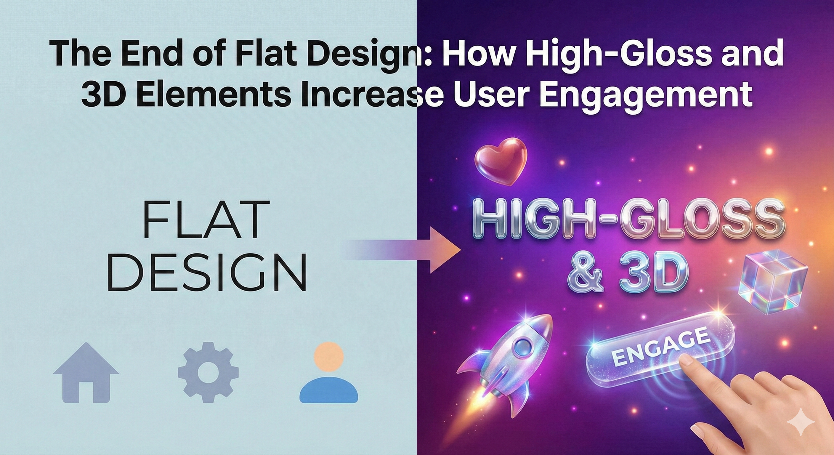
For nearly a decade, the digital landscape has been dominated by a single, pervasive aesthetic: flat design. Born out of a necessity to streamline interfaces for smaller mobile screens and improve loading times across varying network speeds, flat design stripped away complex textures, gradients, and realistic shadows. It championed minimalism, clean typography, and two-dimensional iconography. This movement was a necessary corrective phase, a digital decluttering that prioritized pure utility over decorative excess. However, as this aesthetic saturated every app, website, and operating system, a profound fatigue set in. The digital world became homogenized, a frictionless expanse of sameness where interfaces ceased to evoke emotion or delight. We are now witnessing the end of this era of aggressive minimalism. The pendulum is swinging back toward depth, dimensionality, and tactile sensation, driven by a realization that humans do not live in a flat world and that digital experiences lacking in texture eventually fail to engage our senses.
The retreat from flat design is not a regression to the cluttered, faux-realistic textures of the early 2000s, nor is it a return to the heavy skeuomorphism of the original iPhone era where notes apps looked like legal pads. Instead, it is a sophisticated evolution that leverages modern rendering capabilities to reintroduce physics, light, and materiality into the user interface. This new wave pushes past the boundaries of mere functionality to embrace “digital hedonism” the idea that interacting with software should be intrinsically pleasurable. We are moving away from interfaces that we merely look at, toward interfaces that we feel compelled to touch. By reintroducing high-gloss finishes, soft 3D renders, and complex layering, designers are creating digital environments that feel precious, interactive, and dynamically alive. This shift is not purely aesthetic; it is a strategic response to the crisis of engagement, utilizing the inherent properties of depth and shine to guide user attention, establish clearer visual hierarchies, and foster a deeper emotional connection with the product.
The Tactile Renaissance: Reintroducing Physics to the Pixel
The primary driver behind the resurgence of depth is the innate human desire for tactile feedback. Flat design, in its quest for simplicity, often removed the visual cues that indicate interactivity. When a button is merely a colored rectangle on a colored background, the brain takes a microsecond longer to register it as a clickable element compared to an object that appears raised, possessing volume and catching the light. This new tactile renaissance is about simulating reality to enhance intuitive usability. Modern Web design is transitioning from merely arranging information on a 2D plane to sculpting interactive experiences that possess perceived weight and volume, making digital objects feel real under the user’s fingertip or cursor.
This approach uses advanced techniques like soft shadows that diffuse realistically, multi-layered refractions that mimic glass or polished metal, and subtle parallax effects where foreground elements move faster than the background, creating an immediate sense of deep space. By applying these physics-based rules to interface elements, designers trick the brain into perceiving digital objects as physical entities. A high-gloss card on a screen isn’t just a container for text; it becomes a polished object that feels valuable. A 3D-rendered toggle switch that casts a soft shadow feels spring-loaded and ready for action. This perceived physicality makes the interaction far more satisfying. When a user feels like they are manipulating real objects rather than just tapping pixels, the engagement deepens, turning mundane tasks into moments of micro-delight. We are effectively bringing the satisfaction of flipping a heavy physical switch or pressing a high-quality mechanical button into the digital realm, bridging the sensory gap that flat screens created.
The Neuroaesthetics of Gloss: Why Our Brains Crave Shiny Objects
There is a deep-seated psychological reason why high-gloss and 3D elements are proving so effective at increasing engagement, rooted in evolutionary biology and neuroaesthetics. Humans are instinctively drawn to shiny, glossy surfaces. In the natural world, gloss is often associated with water, a fundamental necessity for survival. In the context of objects, high shine has historically been linked to precious materials like gold, polished gems, or lacquered artifacts items of value and status. When these visual properties are translated into a digital interface, they trigger the same subconscious responses.
A high-gloss interface element instinctively signals value and importance. It tells the user’s brain that this specific area of the screen is special and deserves attention. By strategically applying gloss and 3D treatments to calls-to-action (CTAs) or primary content modules, designers can manipulate the user’s focus without resorting to garish colors or oversized text. Furthermore, the introduction of 3D space significantly aids cognitive load. In a purely flat design, hierarchy is established primarily through size and color contrast, which can quickly become messy in complex applications. By utilizing the Z-axis bringing important elements “forward” toward the user through lighting and shadow while pushing secondary elements “back” the interface better mimics how we process information in the physical world. We naturally prioritize objects that are closer to us. This spatial layering makes complex interfaces easier to scan and understand, reducing mental effort and increasing the likelihood of prolonged engagement. The brain spends less energy deciphering what is important because the “lighting” and “depth” provide intuitive cues, allowing the user to flow through the application with less friction and more enjoyment.
Spatial Interfaces and the Rise of Immersive Hierarchy
The reintroduction of the Z-axis (depth) allows for a completely new way of organizing information, which we might call “Immersive Hierarchy.” In flat design, everything competes for attention on the same surface level. To emphasize something, you have to make it bigger or brighter. In this new paradigm, emphasis is created through proximity and elevation. Elements that are currently active or critical “lift” off the background, casting deeper shadows, while inactive elements recede, becoming dimmer or blurred. This mimics the way a camera lens focuses, or how our own eyes work focusing on the subject while the periphery softens.
This creates a dynamic interface that breathes and reacts. Imagine a dashboard where the analytics card you are hovering over gently floats upward, catching a virtual light source, while the surrounding cards dim slightly. This isn’t just eye candy; it is functional clarity. It creates a “focus tunnel” for the user, isolating the task at hand without the user losing context of where they are in the application. This is particularly crucial for complex SaaS platforms and data-heavy applications. By treating the interface as a 3D environment, designers can stack information density without overwhelming the user. Secondary controls can be hidden “underneath” primary layers, revealed only when the top layer is swiped away or lifted. This utilization of virtual space effectively doubles or triples the usable screen real estate without cluttering the visual field, solving one of the most persistent problems in UI design: how to show more without making it look like more.
Implementing Depth Without Sacrificing Performance
The primary counter-argument to abandoning flat design has always been performance. The fear is that returning to complex graphics will bloat file sizes, slow down loading speeds, and drain mobile batteries. This was a valid concern fifteen years ago, but contemporary technology has rendered it largely obsolete. The new era of depth does not rely on loading massive, static bitmap images for every button state. Instead, it relies on programmatic rendering techniques that are incredibly efficient.
Modern Cascading Style Sheets (CSS) have evolved to handle complex gradients, multiple shadow layers, filters like blurring and frosting, and intricate border radii without requiring external image assets. We can now create convincing frosted glass effects (glassmorphism) or soft, extruded plastic looks (neumorphism) using only code, which is minuscule in file size. Furthermore, the rise of WebGL and performant JavaScript libraries allows for real-time rendering of true 3D models directly in the browser that respond dynamically to user input, such as tilting the phone or moving the mouse. These technologies leverage the device’s Graphics Processing Unit (GPU), ensuring smooth performance even on mobile. The key to implementing these new deep aesthetics lies in restraint and technical acumen. It is not about plastering every surface with reflections; it is about using gloss and dimensionality as strategic accents to highlight interactive paths, ensuring that the interface remains fast and responsive while offering a rich, immersive visual experience. We are effectively rendering “live” materials in the browser rather than downloading pictures of materials, keeping the digital footprint light while the visual impact is heavy.
The Role of Motion and “Micro-Physics”
Static 3D elements are only half the equation; the true magic happens when these elements move. The end of flat design is also the beginning of the era of “Micro-Physics” in UI. If an element looks like it has mass and volume, it must behave like it has mass and volume. When a user drags a high-gloss card across the screen, it shouldn’t just slide linearly; it should carry momentum, perhaps tilting slightly in the direction of the movement, and settling with a gentle bounce when released. This adherence to physics reinforces the illusion of reality.
Motion design in this context is not about flashy transitions but about continuity and weight. When a button is pressed, the light source reflection should shift, indicating a change in surface angle. When a notification appears, it shouldn’t just pop into existence; it should slide in and displace other elements, as if it physically requires space. These micro-interactions are subtle, often lasting less than 300 milliseconds, but they are critical for maintaining the suspension of disbelief. They tell the user’s subconscious that the interface is a coherent physical system. This predictability is comforting. Just as we know what will happen when we drop a ball, we begin to intuitively understand how the interface will react to our inputs. This reduces cognitive load and increases the sense of mastery and control the user feels over the application. An interface that behaves with consistent physical rules feels reliable, sturdy, and high-quality, attributes that are immediately transferred to the brand perception itself.
Escaping the “Sea of Sameness” for Brand Differentiation
From a branding perspective, the shift away from flat design is a survival strategy. Flat design has a democratizing effect, but it also has a homogenizing one. When every startup, bank, and social network uses the same sans-serif fonts, the same flat vector illustrations, and the same ample white space, brand identity erodes. A screenshot of one app becomes indistinguishable from another. Reintroducing texture, specific lighting setups, and unique 3D distinctiveness allows brands to reclaim their visual soul.
A luxury fashion brand might opt for an interface that mimics the properties of silk and polished chrome soft, fluid, and highly reflective. A rugged outdoor equipment retailer might choose a UI that feels matte, textured, and solid, with deep, hard shadows. A fintech app targeting Gen Z might use “Claymorphism” fluffy, inflated 3D shapes that feel friendly and approachable. These aesthetic choices convey brand values instantly, far faster than copy or logos ever could. They set a mood and an atmosphere. By owning a specific “materiality” in their digital presence, companies can create a signature feel that is unique to them. In a crowded marketplace, being distinct is as valuable as being functional. The move to high-gloss and 3D offers an infinite palette of materials and lighting conditions to play with, allowing for a level of brand expression that flat design simply cannot support. It turns the interface into a brand asset rather than just a utility wrapper.
The Future is Spatial and Immersive
As we look toward the immediate future, the influence of Augmented Reality (AR) and Virtual Reality (VR) hardware is beginning to bleed into standard screen design. Devices like the Apple Vision Pro and Meta Quest are training users to expect interfaces that exist in space, that react to light, and that have genuine depth. Even when users are back on their 2D smartphone screens, that expectation lingers. They are beginning to view flat interfaces as “broken” or “missing data.”
This convergence suggests that the high-gloss, 3D trend is not a fleeting style but a foundational shift toward “Spatial Design” across all platforms. We are preparing our digital content to live in a world where the screen is optional. An interface built with defined light sources, Z-axis layering, and volumetric elements is much easier to port into an AR environment than a flat 2D plane. Therefore, adopting these design principles now is a form of future-proofing. It positions digital products to be ready for the next major leap in computing, where the digital and physical worlds overlay completely. But even without the headset, the principles of spatial design make for better 2D experiences today. They respect the user’s intelligence, engage their senses, and provide a level of clarity and delight that flat pixels simply cannot match.
Conclusion
The pendulum shift away from flat design toward high-gloss, 3D, and tactile elements marks a maturation point in digital interface design. We have mastered the basics of usability and cross-platform consistency; now we are rediscovering the soul of the machine. While flat design provided necessary structure during the mobile explosion, it ultimately created a digital landscape devoid of character and emotional resonance. The future of engagement lies in interfaces that acknowledge our physical reality interfaces that play with light, occupy space, and invite touch.
By embracing these immersive qualities, brands can create digital products that are not just easy to use, but a pleasure to inhabit. This is the difference between a tool and an experience. As we move forward, the most successful digital products will be those that manage to balance the efficiency of code with the richness of the physical world, forging stronger, more visceral connections with users in an increasingly crowded and flat digital world. We are leaving the age of the paper-thin web and entering the age of the tangible internet, where pixels have weight, light has meaning, and every interaction is an opportunity to feel something real.