For SEO professionals and business owners, logging into Google Analytics, Search Console, and a half-dozen other tools can feel like drinking from a firehose. It’s easy to confuse activity with progress. We often find ourselves celebrating spikes in “sessions” or patting ourselves on the back for a high volume of “backlinks,” only to realize that these metrics have little correlation with the actual growth of the business.
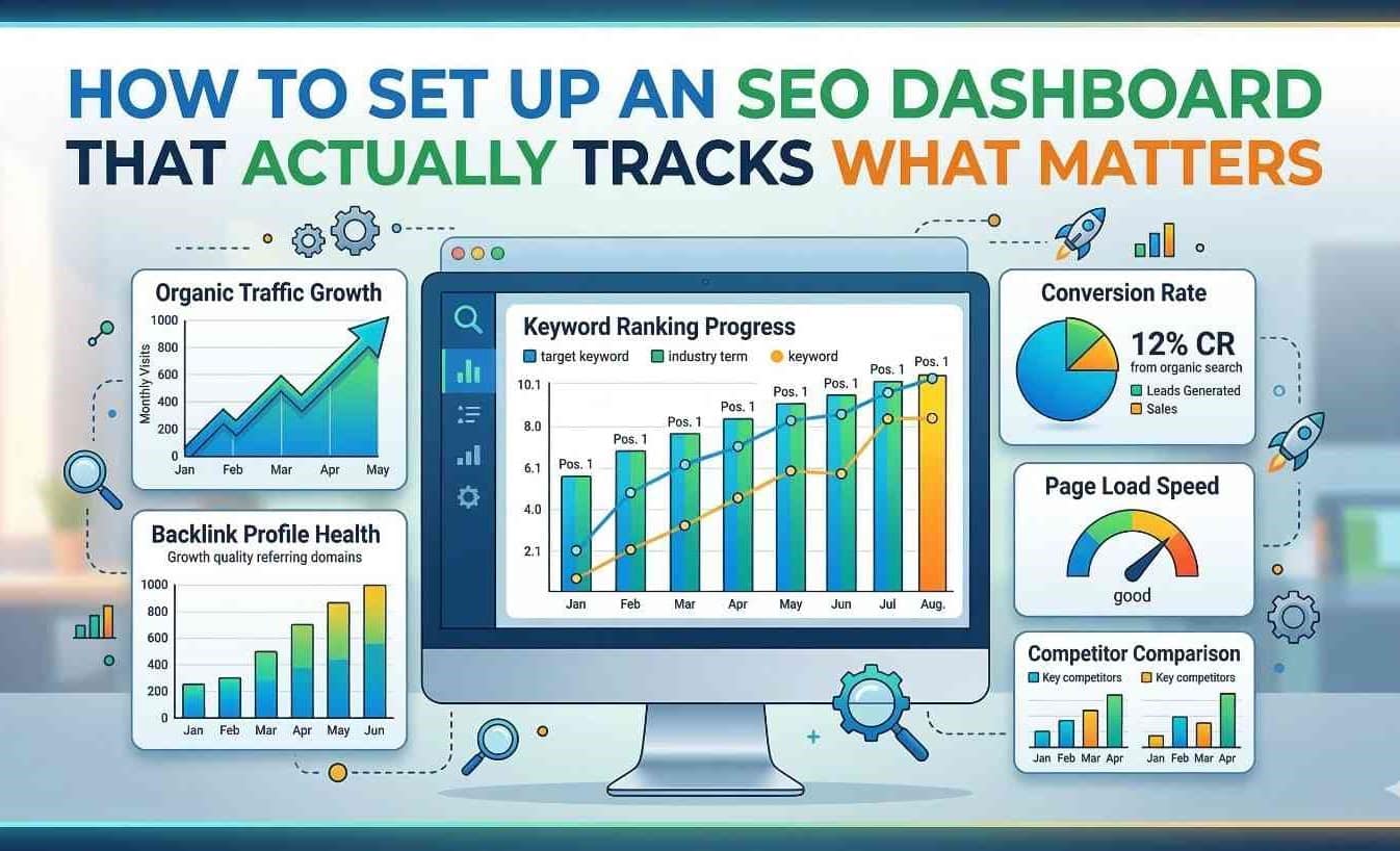
This is where a well-constructed SEO dashboard becomes your most valuable asset. However, there is a significant difference between a dashboard that simply looks pretty and one that drives strategic decisions. A high-performance dashboard is not just a collection of charts; it is a analytical tool that filters out the noise and highlights the signals that directly impact your bottom line.
Setting up a dashboard that tracks what matters requires a shift in philosophy. You must move from vanity metrics to actionable insights, from historical reporting to predictive analysis. This guide will walk you through building a dashboard that serves as a command center for your digital growth, ensuring every graph and table has a purpose.
The Foundation: Defining “What Matters” for Your Business
Before you connect a single data source or drag a chart onto a canvas, you must answer the most critical question: What are we trying to achieve? Too many dashboards fail because they are built on generic templates that don’t align with specific business models. The metrics for a lead-generation law firm are vastly different from those of a global e-commerce fashion retailer.
To define what matters, you need to identify your key performance indicators (KPIs). These shouldn’t just be “Likes” or “Impressions.” Instead, focus on metrics that tie directly to revenue and customer satisfaction. For an e-commerce site, this might be organic conversion rate and average order value. For a B2B SaaS company, it might be free trial sign-ups and demo requests from organic traffic.
Furthermore, context is everything. A spike in traffic on a Tuesday might be due to a random Reddit post, not your SEO strategy. Therefore, your dashboard must allow for segmentation. You need to isolate organic search traffic from direct and paid traffic to understand the true performance of your SEO campaigns. By setting up comparisons—such as month-over-month (MoM) and year-over-year (YoY) you normalize your data against seasonality and market fluctuations. This foundational step ensures that the dashboard you build is rooted in business reality rather than abstract numbers .
Why Vanity Metrics Are Ruining Your Strategy
It is tempting to fill a dashboard with metrics that make us feel good. Total pageviews, for example, is a classic vanity metric. While it’s nice to see a high number, pageviews alone don’t tell you if anyone actually read the content, trusted the brand, or took the desired action. Similarly, “Domain Authority” (or similar proprietary scores) fluctuates frequently and, while useful for benchmarking, doesn’t directly correlate with cash in the bank if you aren’t ranking for money keywords.
Vanity metrics create a dangerous illusion of success. They allow you to report that “traffic is up,” which keeps stakeholders happy, while obscuring the fact that conversions are flat or declining. A meaningful dashboard prioritizes “cost per acquisition” and “customer lifetime value” from organic channels over mere traffic volume.
To combat this, you must integrate “micro-conversions” into your dashboard. These are the small steps users take that lead to a sale, such as signing up for a newsletter, downloading a whitepaper, or using an on-site calculator. By tracking these, you get a clearer picture of engagement quality and can predict future revenue more accurately. If your dashboard isn’t helping you answer “Is our SEO making us money?” then it isn’t tracking what matters .
Bridging the Gap: When to Hire an SEO Expert
Building a sophisticated, insight-driven dashboard is not just a technical exercise; it is a strategic one. It requires a deep understanding of how search engines interpret code, how user experience affects rankings, and how content satisfies intent. While drag-and-drop tools have made dashboard creation more accessible, interpreting the data correctly remains a complex skill.
This is the point in your journey where you might realize that your current team lacks the bandwidth or the specialized knowledge to connect the dots between technical SEO fixes and revenue trends. If you find yourself staring at a dashboard full of data but unable to formulate a strategy to fix declining click-through rates or rising bounce rates on key landing pages, it might be time to hire SEO expert. An experienced professional doesn’t just look at the dashboard; they diagnose it. They can look at a Core Web Vitals alert and understand exactly how it impacts your specific sales funnel, prioritizing fixes that will move the needle rather than just cleaning up a checklist. Bringing in an expert ensures that your dashboard evolves from a reporting tool into a strategic asset that guides your business toward high-ROI activities .
Choosing the Right Tools for Your Dashboard
Once your KPIs are defined and your strategy is clear, it’s time to select the tools to visualize this data. While many enterprises use Power BI or Tableau, the most accessible and popular tool for SEOs remains Looker Studio (formerly Google Data Studio). Its power lies in its ability to act as a central hub, pulling in data from disparate sources .
The key to an effective dashboard is data integration. You need to connect:
- Google Search Console (GSC): To see which queries trigger your site’s presence and how often users click through.
- Google Analytics 4 (GA4): To understand what users do after they land on the site.
- Rank Tracking Tools (e.g., SE Ranking, Ahrefs): To monitor keyword positions across different geographies and devices.
- CRM Data: To close the loop and see which organic leads actually turned into paying customers.
By using Looker Studio’s partner connectors, you can blend these datasets. For example, you can create a chart that shows keywords that are not only in the top 10 positions but also have a high conversion rate in GA4. This level of blended data is impossible to achieve with standalone platform dashboards .
Building the Technical Health Center
Search engines prioritize sites that are technically sound. If your dashboard doesn’t have a dedicated section for technical health, you are flying blind. This section should move beyond simply listing errors and instead prioritize them based on business impact.
Start with Core Web Vitals. Don’t just track whether your Largest Contentful Paint (LCP) is “good” or “needs improvement.” Correlate this data with engagement metrics. A good dashboard will show you that a 0.5-second improvement in LCP on your product pages led to a 5% decrease in bounce rate. This turns a technical metric into a business case .
Next, monitor Crawl Stats and Indexation. A sudden drop in crawled pages could indicate a server error or a robots.txt issue that is preventing Google from finding your new content. Your dashboard should alert you to these anomalies. Additionally, track your 404 pages. Specifically, look for 404 errors on pages that have backlinks. Losing those pages means you are losing “link juice” and potential traffic. A technical health dashboard helps you plug these leaks before they become waterfalls .
The Content Performance Matrix
Content is the vehicle for SEO, but not all content is created equal. Your dashboard needs to help you conduct a content audit continuously. This is best visualized using a scatter plot or a matrix chart.
On one axis, place engagement metrics (such as average time on page or scroll depth). On the other axis, place business metrics (such as conversion rate or revenue). This creates four quadrants:
- High Engagement / High Conversion: These are your star players. Protect them, update them regularly, and build internal links to them.
- High Engagement / Low Conversion: These are informational pieces that attract an audience but don’t sell. They are prime candidates for adding internal links to money pages or adding new calls-to-action.
- Low Engagement / High Conversion: These might be “hidden gems”—pages that rank for obscure but profitable terms. They need better on-page SEO or design improvements to boost engagement.
- Low Engagement / Low Conversion: These pages are weighing down your site’s crawl budget. Consider consolidating or deleting them .
By using this matrix, your dashboard tells you exactly what content action to take next, rather than just listing page URLs.

Monitoring Competitor Landscapes
An inward-facing dashboard only tells half the story. SEO is a zero-sum game; if your competitor gains visibility, you lose it. Therefore, a dashboard that tracks what matters must include a competitive analysis module.
Integrate tools that track Share of Voice (SOV) . SOV measures the percentage of clicks your site gets versus the total clicks available in the market for your target keywords. If your traffic is flat but your SOV is rising, it means the market is shrinking, and you are actually doing well. Conversely, if your traffic is flat and SOV is dropping, a competitor is eating your lunch.
Track the overlap in keywords between you and your top three competitors. Identify keywords they rank for that you don’t. This gap analysis is a goldmine for content strategy. Your dashboard should automatically flag these opportunities, allowing you to brief your content team on exactly what topics to target to reclaim market share .
Customizing Views for Different Stakeholders
One of the biggest mistakes in dashboard creation is the “one-size-fits-all” approach. If you present the same dashboard to your technical developer, your content writer, and your CEO, you will lose everyone’s attention. The developer will ignore revenue data, and the CEO will glaze over at crawl depth charts.
A sophisticated setup uses dashboard “pages” or “tabs” tailored to the audience:
- The Executive Summary: This view is high-level. It focuses on revenue from organic search, total organic new users, and goal completions. It answers the question, “Are we winning?” without requiring any SEO knowledge .
- The Tactical SEO View: This is for the in-house team. It includes rankings for priority keywords, backlink acquisition rates, and site audit issue lists. It answers the question, “What do we fix today?”
- The Content View: This focuses on topic clusters, social shares of content, and engagement metrics. It helps the editorial team understand what topics resonate with the audience.
By creating these segmented views within a single Looker Studio report, you ensure that every stakeholder finds value in the data, fostering a culture of data-driven decision-making across the organization .
Automation and Alerts: The Proactive Dashboard
The ultimate goal of a dashboard is to reduce reaction time. If you wait for your monthly meeting to look at the data, you are already 30 days behind on a problem. Modern dashboards should be proactive, utilizing alerts and automated data refresh schedules.
Set up email or Slack alerts for specific triggers. For example:
- If organic traffic drops by more than 20% in a single day.
- If a “money page” falls from page 1 to page 3 for its primary keyword.
- If Google Search Console reports a sudden spike in “soft 404s” or indexing errors.
Automation ensures that you are notified of critical changes in real time. Furthermore, ensure your data sources refresh automatically. Looker Studio can be scheduled to send updated PDF reports to clients or stakeholders every Monday morning. This positions you as the expert who is always on top of the data, rather than the one scrambling to pull reports manually .
From Data to Direction: Review Cycles
Data visualization is only the first step; interpretation is where the value lies. A dashboard is a tool, not a strategy. Therefore, you need to establish regular “SEO review cycles” where the team gathers around the dashboard (or a printed version of it) to discuss the “why” behind the numbers.
During these reviews, don’t just read the numbers aloud. Discuss anomalies. Why did a specific blog post suddenly start ranking? Was it because of a new backlink? If so, how can we replicate that? Why is the click-through rate dropping for our brand keywords? Is Google showing more ads or featured snippets pushing us down?
Use the dashboard to validate your hypotheses. If you implemented schema markup last month, go to the dashboard and check if rich snippets increased your CTR. This scientific approach to SEO hypothesis, action, measurement, iteration—turns your dashboard into the engine room of your growth marketing efforts .
Conclusion: The Dashboard as a Compass
Setting up an SEO dashboard that actually tracks what matters is an exercise in discipline. It requires you to ignore the seductive allure of vanity metrics and focus on the hard numbers that correlate with business success. By integrating technical, content, and competitive data into a customized, automated, and role-specific tool, you transform raw data into a strategic compass.
Remember, the dashboard doesn’t do the work; it shows you where the work is needed. Whether you build this internally or decide to hire SEO expert to architect it for you, the goal remains the same: to create a single source of truth that empowers your team to make faster, smarter, and more profitable decisions in the ever-evolving landscape of search.