Chapter 1: The Psychological Rejection of Synthetic Perfection
1.1 The Advent of AI Fatigue
By March 2026, the digital landscape has undergone a radical transformation. In the early 2020s, the goal of every software company was “polish.” We chased perfectly symmetrical icons, hyper-realistic 3D renders, and stock photography that depicted a sterilized version of office life. However, the mass adoption of Generative AI has turned “perfection” into a commodity. When every startup in the UAE or the UK can generate a stunning, high-gloss website in under sixty seconds using a single prompt, “perfect” loses its value. It becomes background noise.
This has led to a documented phenomenon we call Synthetic Fatigue. Users in 2026 have developed a subconscious “cynicism” toward high-definition digital assets. When a visitor lands on thesoftix.com, their brain performs a split-second check for authenticity. If the visuals feel too “computed,” the brand is categorized as a low-effort entity. Custom, hand-drawn illustrations act as a “Humanity Verified” badge. They signal that a human engineer and a human designer spent hours thinking, sketching, and refining. In an era of automation, effort is the ultimate luxury.
1.2 The “Whiteboard Effect” and Cognitive Load Management
Software is inherently abstract. Explaining a complex SaaS architecture or a multi-tenant CRM system to a non-technical stakeholder is one of the greatest challenges in our industry. Traditional diagrams often use rigid, clinical boxes and arrows that can feel intimidating or “dry.”
The “Whiteboard Effect” leverages the psychology of the classroom. When we see a hand-drawn doodle, our brains relax. We associate sketches with brainstorming, collaboration, and simplified explanation. By using “inky” lines and handwritten annotations, The Softix reduces the “Cognitive Load” of the user. Instead of forcing them to decipher a complex 3D model, we guide them through a “storyboard.” This makes the software feel accessible, friendly, and most importantly usable. It shifts the perception of your product from a “complex tool” to a “helpful partner.”
Chapter 2: The “Nature Distilled” Aesthetic A Deep Dive into 2026 Trends
2.1 The Philosophy of Grounding
March 2026 is defined by a desire for “grounding.” After years of living in the “metaverse” and neon-lit digital spaces, the global design community is returning to the earth. The Nature Distilled aesthetic is a rejection of the “Cyberpunk” blue and “Silicon Valley” purple. This evolving philosophy is increasingly shaping modern UX UI DESIGN, CUSTOM WEB DESIGN, and WORDPRESS DESIGN CUSTOMIZATION, influencing how brands create digital environments that feel calm, human-centered, and naturally intuitive.
For The Softix, this means a fundamental shift in the site’s color theory. We are moving toward Cloud Dancer a warm, creamy off-white that mimics the appearance of natural vellum or unbleached paper. This isn’t just a stylistic choice; it’s a physiological one. High-contrast pure white (#FFFFFF) causes significant eye strain over long periods. Cloud Dancer provides a “calm” canvas that allows hand-drawn elements to pop without overwhelming the user’s vision.
2.2 Tactile Textures and Haptic Visuals
Even though we are looking at glass screens, the human brain craves texture. In 2026, “flat” is dead. We use Tactile Maximalism to add depth. This involves layering hand-drawn sketches over subtle grain textures, paper-folds, and “charcoal dust” effects.
When a user sees a “pencil-sketched” button on your CRM dashboard, their brain simulates the feeling of touching paper. This “haptic visual” creates a more memorable sensory experience than a standard flat button. It makes the digital interface feel “physical,” which increases the user’s sense of ownership over the software.
Chapter 3: Strategic Industry Application Code, Command, Convert
3.1 SaaS Development: The Annotated “Blueprint” Style
For your SaaS Development service page, the goal is to prove expertise. In 2026, we do this through the Annotated UI. Instead of showing a gallery of finished apps, we show the “Architect’s Blueprint.”
The Execution: We take a core interface you developed and overlay it with digital “pencil” marks. We circle a specific API integration point and add a handwritten note: “Custom Load-Balancing Logic here.”
The Strategic Impact: This proves to the client that The Softix doesn’t just “buy a template.” It shows that your US-based engineers are making granular, strategic decisions. It transforms the sales pitch from “Look what we made” to “Look how we think.”
3.2 CRM and Enterprise Solutions: The Empathy-Led Interface
Enterprise software has a reputation for being cold, monolithic, and difficult to adopt. This “User Friction” is the #1 reason SaaS products fail.
The Execution: We implement Naive Authenticity. We use intentionally simple, “doodle-style” characters to guide the user. If a user is setting up a new database, a small hand-drawn “helper” character might appear with a speech bubble.
The Strategic Impact: It removes the fear of the “Unknown.” By making the interface feel like a friendly sketch, you lower the barrier to entry. This is a massive selling point for companies in the UAE or UK who are worried about their staff’s ability to learn new technology.
Chapter 4: The “Green UX” Revolution and Technical Optimization
4.1 Sustainability as a Ranking Factor
In 2026, the environmental impact of a website is a public-facing metric. Google now displays a “Carbon Footprint” badge in search results. Heavy, AI-generated images and 4K videos are the “gas guzzlers” of the internet.
Hand-drawn illustrations, specifically those built as SVGs (Scalable Vector Graphics), are the “Electric Vehicles” of web design. A complex hand-drawn scene can be coded in a few kilobytes, whereas a high-res photograph might be several megabytes.
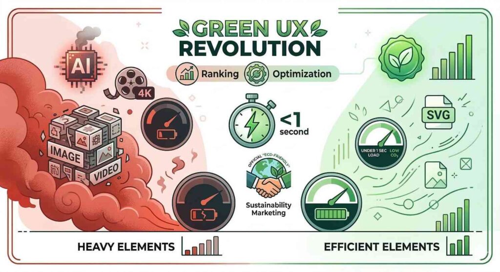
LCP (Largest Contentful Paint): By using lightweight sketches, The Softix can ensure that your pages load in under 1 second, even on slower mobile networks in rural areas.
Sustainability Marketing: You can officially market your projects as “Eco-Friendly Designs,” which appeals to the growing demographic of environmentally conscious enterprise clients.
4.2 Accessibility for the Neurodivergent
2026 has seen a massive push for Inclusive Design. Standard corporate layouts can be overwhelming for users with ADHD or sensory processing disorders. Hand-drawn illustrations, with their clear lines and reduced “visual noise,” are naturally more accessible. They provide clear “Visual Affordances” showing the user exactly where to look and what to click without the distraction of lens flares or complex gradients.
Chapter 5: The Softix Hybrid Workflow The Future of Craft
How do we maintain this “hand-crafted” feel while staying agile? We utilize an Agentic Collaborative Loop.
Phase 1: Generative Ideation. We use AI to brainstorm 100 visual metaphors for a client’s specific problem (e.g., “How do we visualize data security?”).
Phase 2: The Human Anchor. A Softix designer selects the best metaphor and creates a “Primary Sketch.” This ensures the “soul” of the image is human.
Phase 3: Digital Refinement. We use vector-based tools to ensure the illustration is scalable for everything from mobile screens to giant billboards in Austin or Dubai.
Phase 4: Kinetic Animation. We add “Micro-Interactions.” When a user hovers over a hand-drawn icon, it might “shiver” or “bloom,” creating a moment of delight that a static AI image simply cannot provide.
Summary: Leading the Great Softening
At The Softix, our mission has always been to bridge the gap between human needs and technical possibilities. In March 2026, that bridge is made of “pencil and paper.”
By choosing custom hand-drawn illustrations over generic AI-generated assets, you aren’t just following a trend you are making a statement. You are stating that your code is artisanal, your strategies are bespoke, and your commitment to the human experience is unwavering.